Add a Chart to the Calculator
This function allows you to create and display a graph that dynamically shows multiple data points to the user. There are 4 different types of charts available for now:
‘line’ - Data represented as dots joined by a straight line
‘area’ - Similar to ‘line’ but without dots and the area below filled in. Allows to stack datasets on top of each other.
‘bar’ - Bar chart with the ability to stack multiple datasets.
‘pie’ - Pie chart where each data point represents a fraction of the total area of a circle
ctx.addChart({type: chartType,
              data: chartData,
              labels: dataLabels,
              title: chartTitle,
              stacks: stackVars,
              afterVariable: myVar,
              alwaysShown: aBool
            });
Warning
This function only works inside a onResult context.
Each value of the key-value pair on the input is of a different type, so we need to explore each of the options in detail.
Arguments
The argument of this function is by far the most complicated. It is a dictionary with key-value pairs described in the table below. However, each value can be a complicated type itself and, on top of that, not all types of charts support all the pairs. If you want to learn more about each specific type, check the below.
Note
The data for the x-axis in all but pie charts is taken as a string, not as a number. The values will always appear equally distributed. All y-values are represented in order of input from left to right regardless of their associated x-values.
Colours of the datasets
Omni calculator doesn’t support explicitly choosing colours for each of the datasets. The colours are assigned automatically from first to last dataset following their order in the input. The following chart represents the relation between position and colour.
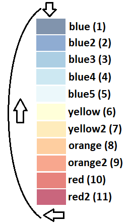
This means that, even though you technically can, you should never display more than 11 datasets in one Omni chart.
Tip
If you want to select specific colours for your data, you can fill in you array with empty entries moving your data to the desired position. Check the detailed section for Line Charts, Area Charts, Bar Charts, and Pie Charts to see a practical example for each type of chart.
Chart types and their peculiarities
Line Chart
This is the most straight forward version of the chart. It doesn’t support stack option.
The input needs to be an array of arrays of numbers. Each array of numbers represent one data point for each dataset to be represented. The first number in the array is the x value (rather label) for that point and can be a string. The rest of the values must be numbers representing the y value of said point.
Here is an example of how chartData has to be created for this chart.
// the data represented are 4 point of the equations
// 1st: y = 2x + 1
// 2nd: y = 3x + 0
var chartData = [[0, 1,  0],
                 [1, 3,  3],
                 [3, 7,  9],
                 [4, 9, 12],
                ];

// Now we call the function with this data
ctx.addChart({type: 'line',
              data: chartData,
              labels: ['x', 'y1', 'y2'],
              title: "Line Chart",
              });
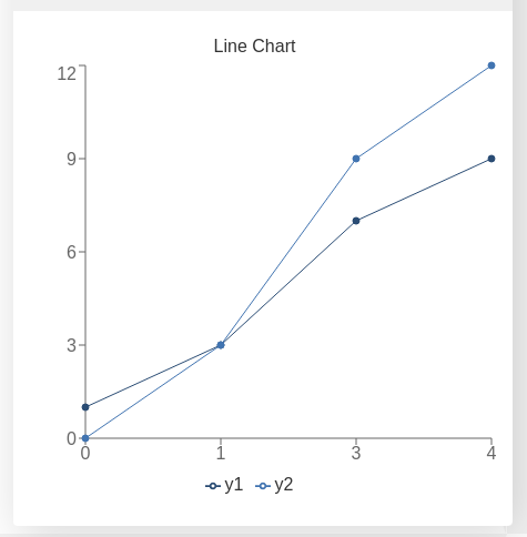
Line chart resulting from the data defined above
This type of chart does support stacking but it is not recommend to be used. That field need not be included in the input of the function addChart.
Bar Chart
This function takes a similar input to the line chart, but this type of chart also supports stacking.
Here is an example of how chartData has to be created for this chart. And how to call the function addChart to stack two datasets one on top of the other
// the data represented are 4 point of the equations
// 1st: y = 2x + 1
// 2nd: y = 3x + 0
var chartData = [[0, 1,  0],
                 [1, 3,  3],
                 [3, 7,  9],
                 [4, 9, 12],
                ];

// Now we call the function with this data
ctx.addChart({type: 'bar',
              data: chartData,
              labels: ['x', 'y1', 'y2'],
              title: "Bar Chart",
              stacks: [{
                        columns : [1, 2] ,
                        sumLabel: "Sum of Bars"
                      }],
              afterVariable: lastVar,
              alwaysShown: false
            });
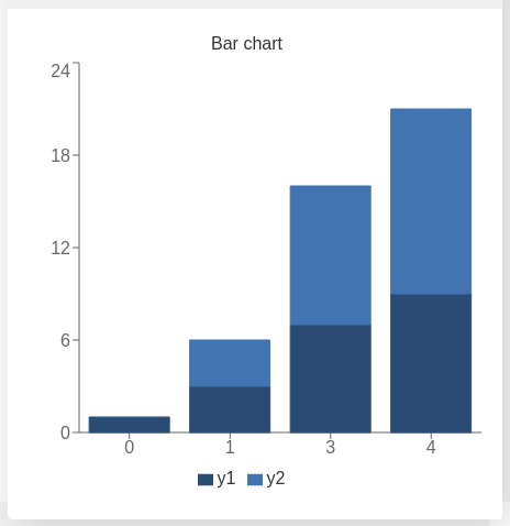
Bar chart resulting from the data defined above
Area Chart
The area chart is a hybrid between the line and the bar charts. The syntax calling and options are the same as the bar chart and the only difference when calling addChart is the obvious substitution of bar to line.
Here is the respective example:
// the data represented are 4 point of the equations
// 1st: y = 2x + 1
// 2nd: y = 3x + 0
var chartData = [[0, 1,  0],
                 [1, 3,  3],
                 [3, 7,  9],
                 [4, 9, 12],
                ];

// Now we call the function with this data
ctx.addChart({type: 'area',
              data: chartData,
              labels: ['x', 'y1', 'y2'],
              title: "Area Chart",
              stacks: [{
                        columns : [1, 2] ,
                        sumLabel: "Sum of Bars"
                      }],
              });
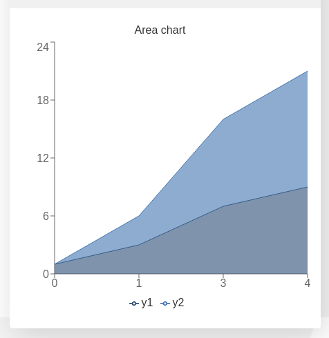
Area chart resulting from the data defined above
Pie Chart
The input needs to be an array of dictionaries where each of the items contain two key-value pairs. The necessary keys are name representing the label of that data point and value being the numerical value of said data point.
Here is an example of how chartData has to be created for this chart.
var chartData = [{name :  ' Value A ' ,
                  value: 32
                 },
                 {name :  ' Value B ' ,
                  value: 15
                 },
                 {name :  ' C value ' ,
                  value: 33
                }];
ctx.addChart({type: 'pie',
              data: chartData,
              title: "Pie chart",
              afterVariable: "",
              alwaysShown: false
            });
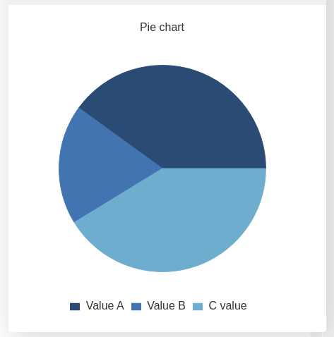
Pie chart resulting from the data defined above
Unlike the rest of chart types, pie charts need not include labels. Stacks are also not supported.