How to create a line chart
We are now going to take a look at how to create a line chart, but this time we will not use statically created values like in the section addChart.
When making a calculator the data normally has to be… calculated (surprising, right?) based on the input given by the user. Behind this calculation there is always a function that depends on some parameters, normally it’s either x or time, but could be anything.
To create the data we will use a for loop and we will use the method push which adds a new entry at the end of an array. Our ‘entry’ represents a point and is an array with the values we want to display.
Practical example
We first define the example function: f(x) = xⁿ + offset. We will display the data from x = a to x = b. The user will input two different values for n and offset giving us the chance to show several datasets in one graph.
Our goal here is to create a line chart that will show two different functions together. The user will define n and offset for each of our functions.
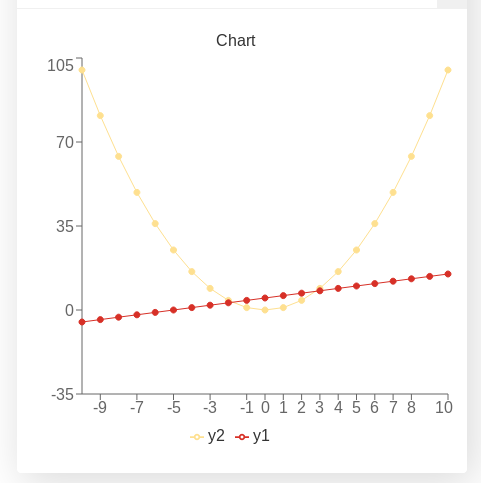
Example of a line chart with two user defined functions
We have chosen the following colours for this chart: red (for n1 and offset1) and yellow2 (for n2 and offset2) which corresponds to positions 10 and 7 in the array of data 1 as shown in the color coding in charts picture we showed in a previous section.
See also
We have created a calculator using this code so that you can see the results for yourself. Check it out at Charts (line) on BB.
Code and comments
Let’s look that the example code now:
 1'use strict';
 2
 3omni.onResult(['a','b','offset1','n1','n2','offset2'], function(ctx){
 4
 5    var chartData = [],
 6        n1 = ctx.getNumberValue('n1'),
 7        n2 = ctx.getNumberValue('n2'),
 8        offset1 = ctx.getNumberValue('offset1'),
 9        offset2 = ctx.getNumberValue('offset2'),
10        a = ctx.getNumberValue('a'),
11        b = ctx.getNumberValue('b');
12
13    for (var i = a; i <= b; i++){
14        chartData.push([mathjs.format(i, 2), // x-value
15                        ,,,,,,              // blank data to match colors
16                        mathjs.pow(i, n2) + offset2, // yellow2 y-value
17                        ,,                 // black data to match color
18                        mathjs.pow(i, n1) + offset1 // red y-value
19                       ]);
20    }
21    ctx.addChart({type: 'line',
22                labels: ['x',,,,,,, 'y2',,, 'y1'],
23                data: chartData,
24                title: "Chart",
25                afterVariable: "",
26                alwaysShown: false
27                });
28});
You can see here that the data is created inside a for loop in lines 13-18. Pay attention also to the empty spaces between data that allow us to get exactly the colour we want.
Warning
The position of the labels need to match the position of the data in the array, otherwise the data will not be shown.
There is little to not difference between making a basic line chart and making a bar or area chart. We have purposely not activated the option to stack the data as this option is very prone to errors.
Tip
For cleaner code that is easy to understand consider using functions when performing complex operations inside the for loop. You might also want to look up the Advanced uses of arrays section or the map method.
Footnotes
- 1
The first position in an array is the position “0” (zero) and corresponds to the x-value.